Design brief
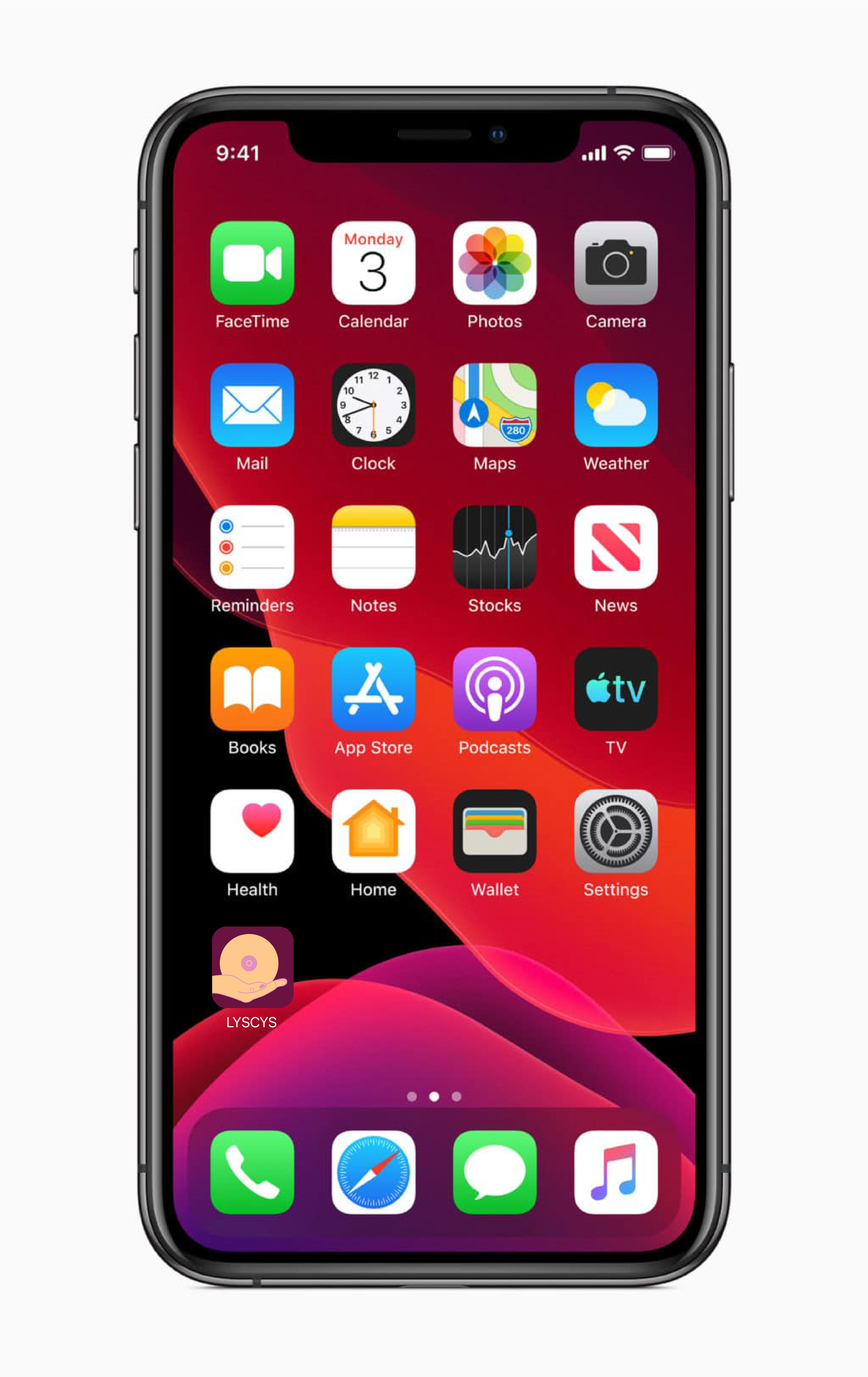
For the awareness campaign project, students had to choose a topic and create a single icon that represented their chosen issue. the icon had to be usable in a poster, sticker, and app icon, which posed the additional challenge of great variants in scale. a tagline was additionally required to place on the poster and sticker.
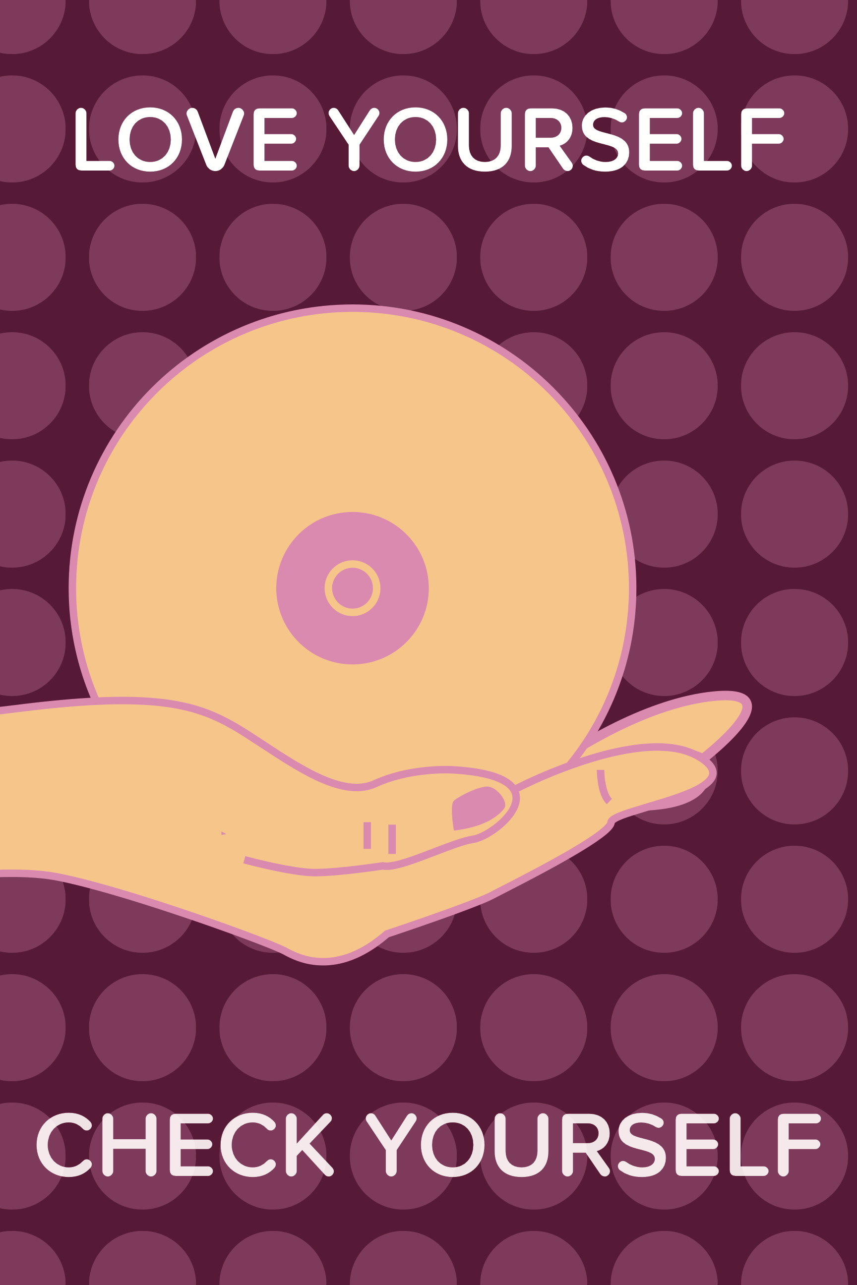
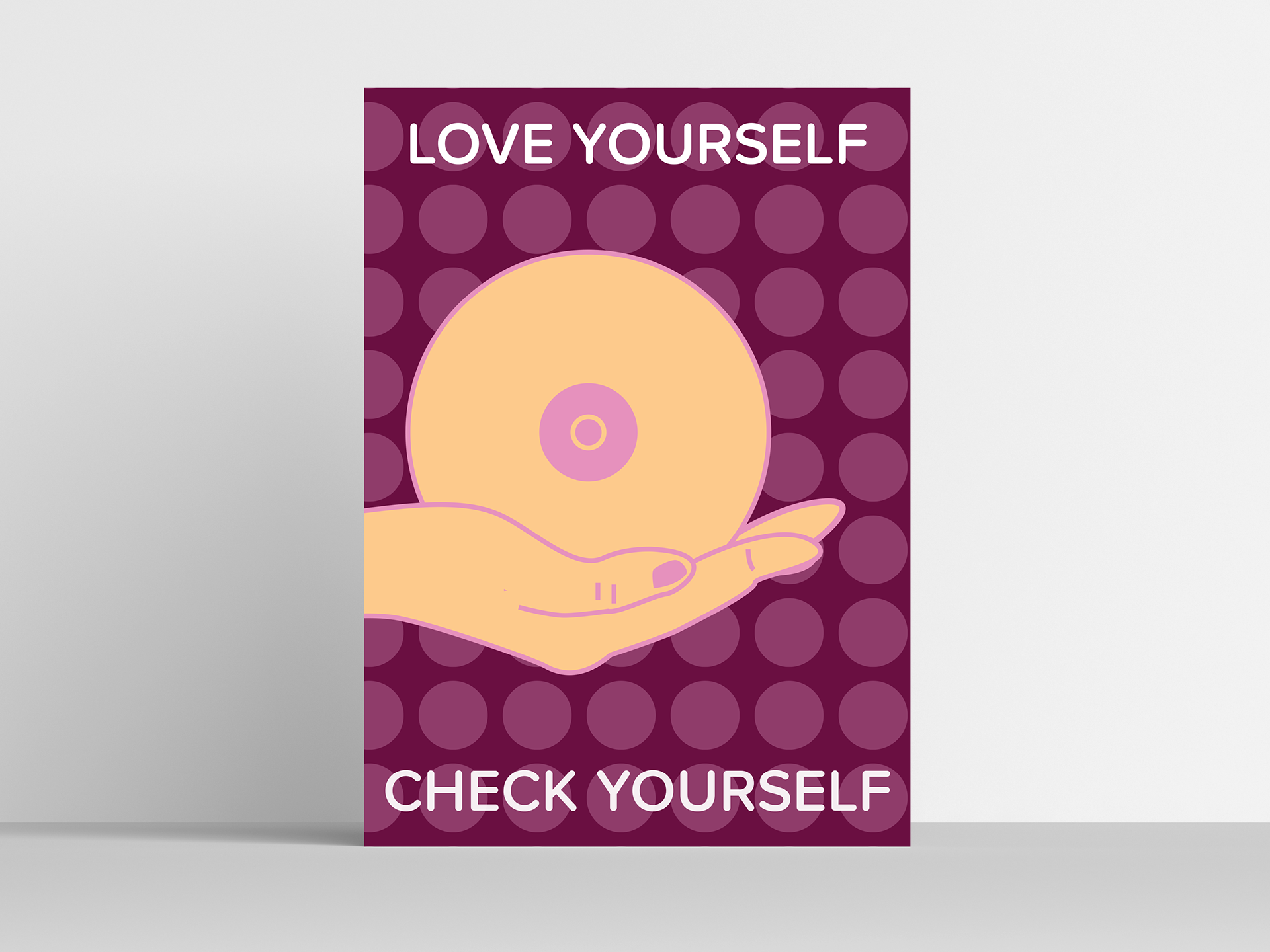
my focus is on breast cancer awareness, specifically in young women. this is an issue that is personal to me and something I know quite a lot about. i wanted to create a friendly icon that invited discussion on a topic THAT IS DIFFICULT TO TALK ABOUT, LET ALONE VISUALLY PORTRAY WITHOUT CAUSING DISCOMFORT OR INSULT TO THE AUDIENCE.

initial research and sketches
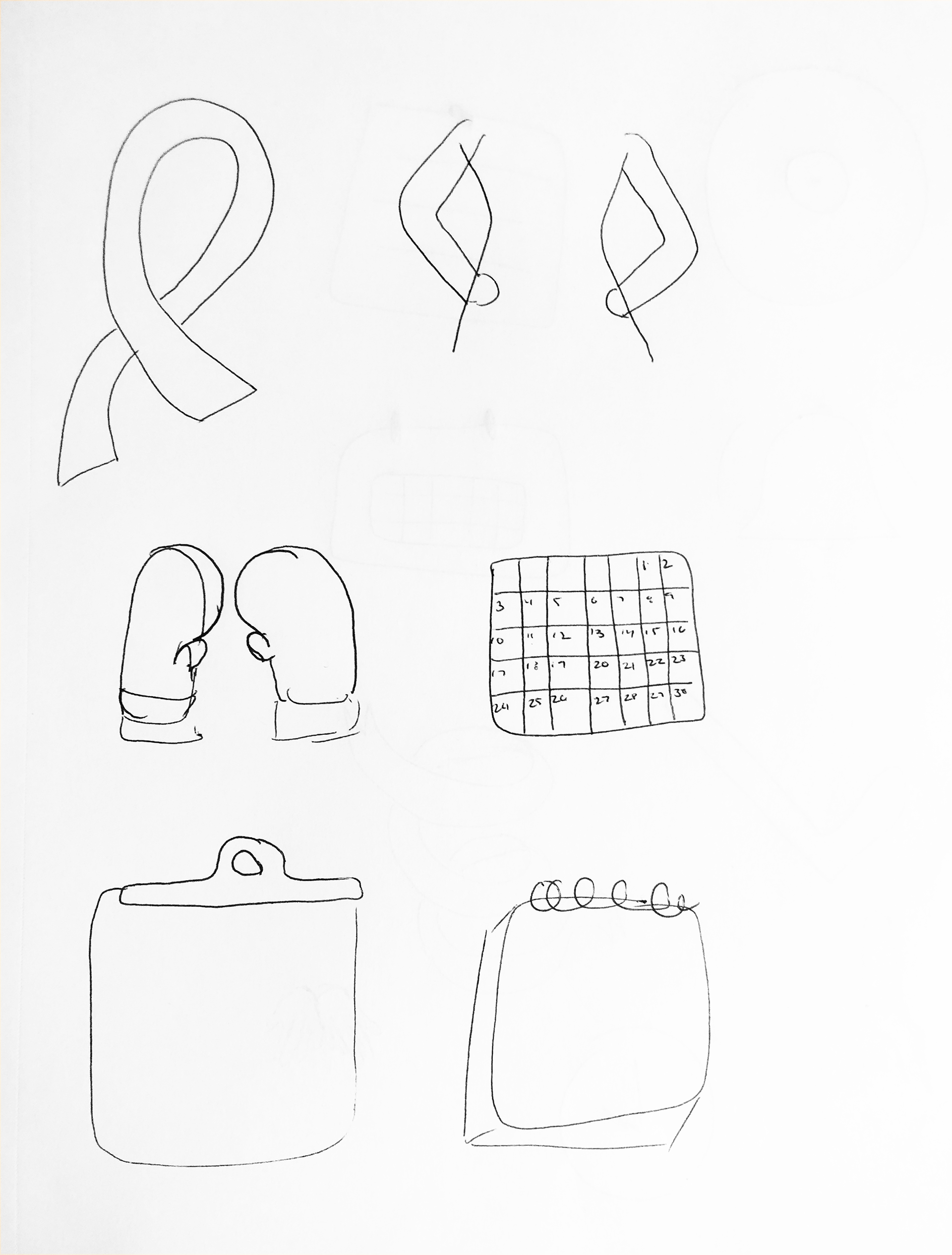
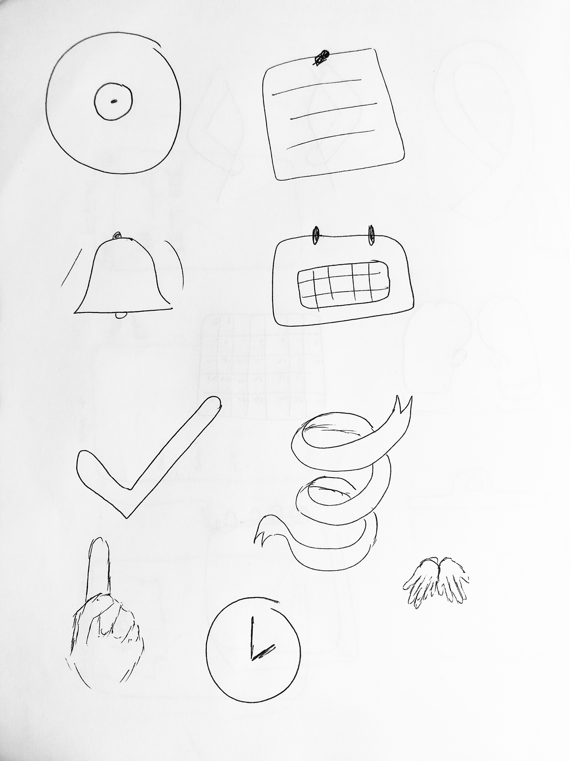
in order to create the icon, students chose a number of symmetrical and asymmetrical symbols to combine into what would be the single image. I wanted to express the idea of the importance of checking yourself and that it should be a habit to get into. i looked into making a simplified breast. it was difficult to get It to read without making it too detailed. it was important to keep it simple and friendly so as not to make the final icon too intimidating or uninviting.
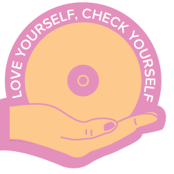
FINAL PRODUCT
FOR THE FINAL ICON, I FOUND THAT ASSOCIATING THE SIMPLIFIED BREAST WITH ANOTHER BODY PART HELPED IT READ MUCH BETTER. PLACING IT ON THE HAND REINFORCED THE IDEA OF CHECKING ONESELF, AS WELL AS ESTABLISHING A CARING AND TENDER TONE. IT PAIRS WELL WITH THE TAGLINE, "LOVE YOURSELF, CHECK YOURSELF."