DESIGN BRIEF
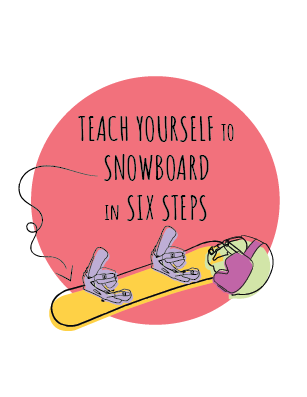
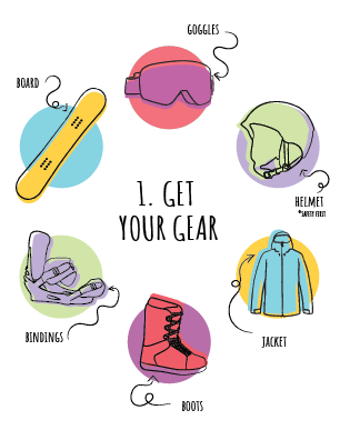
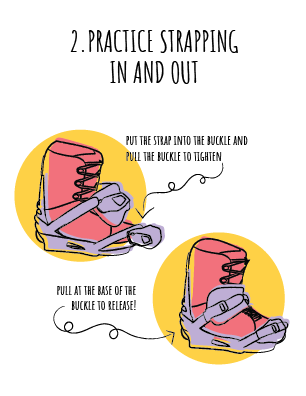
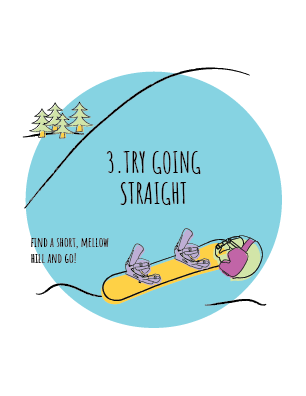
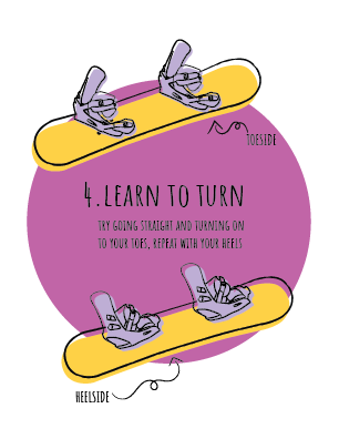
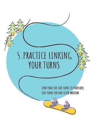
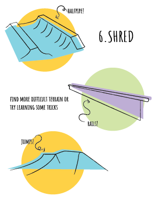
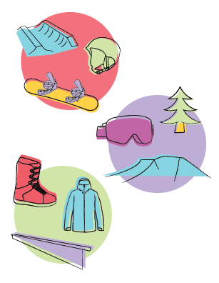
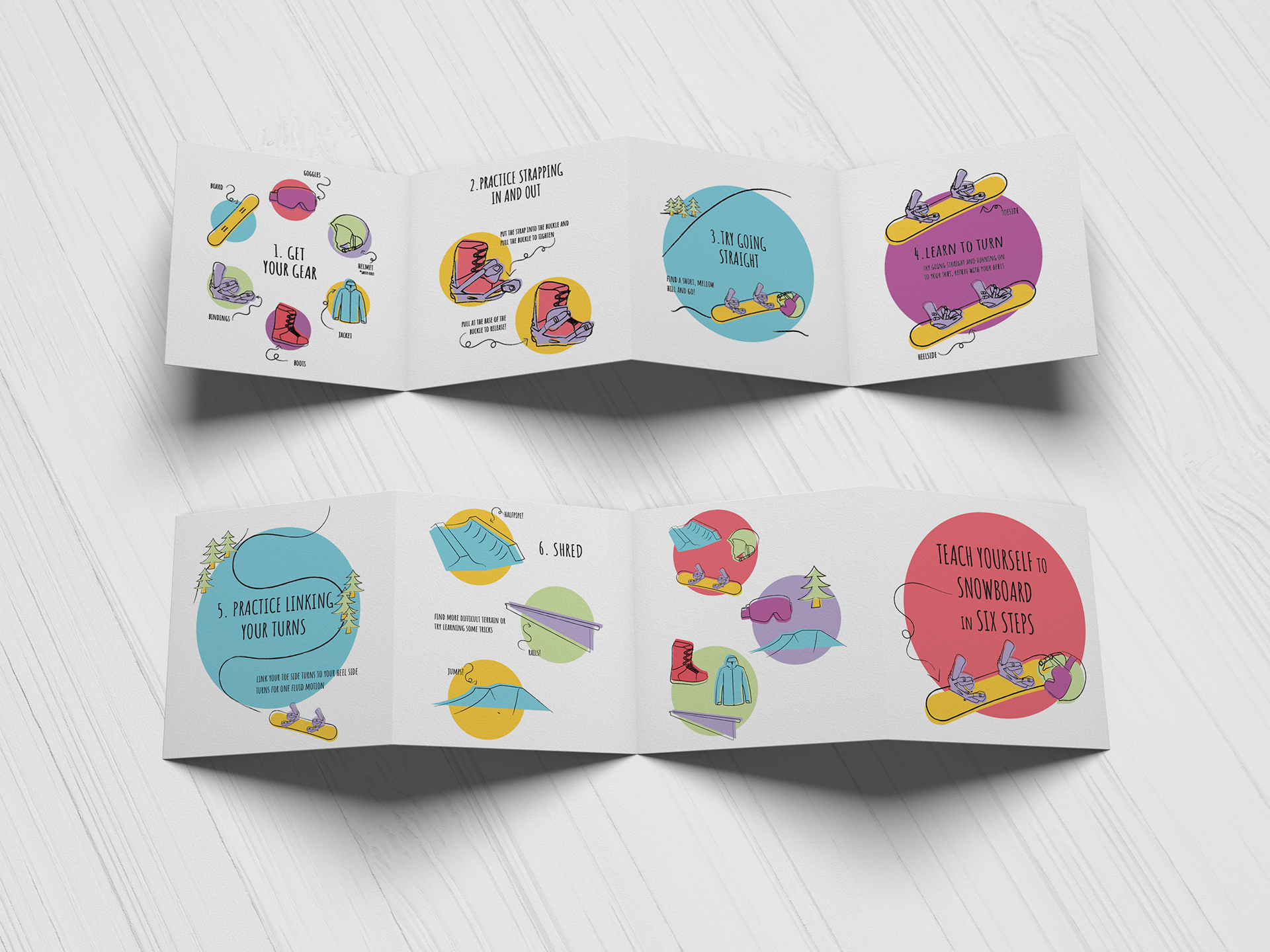
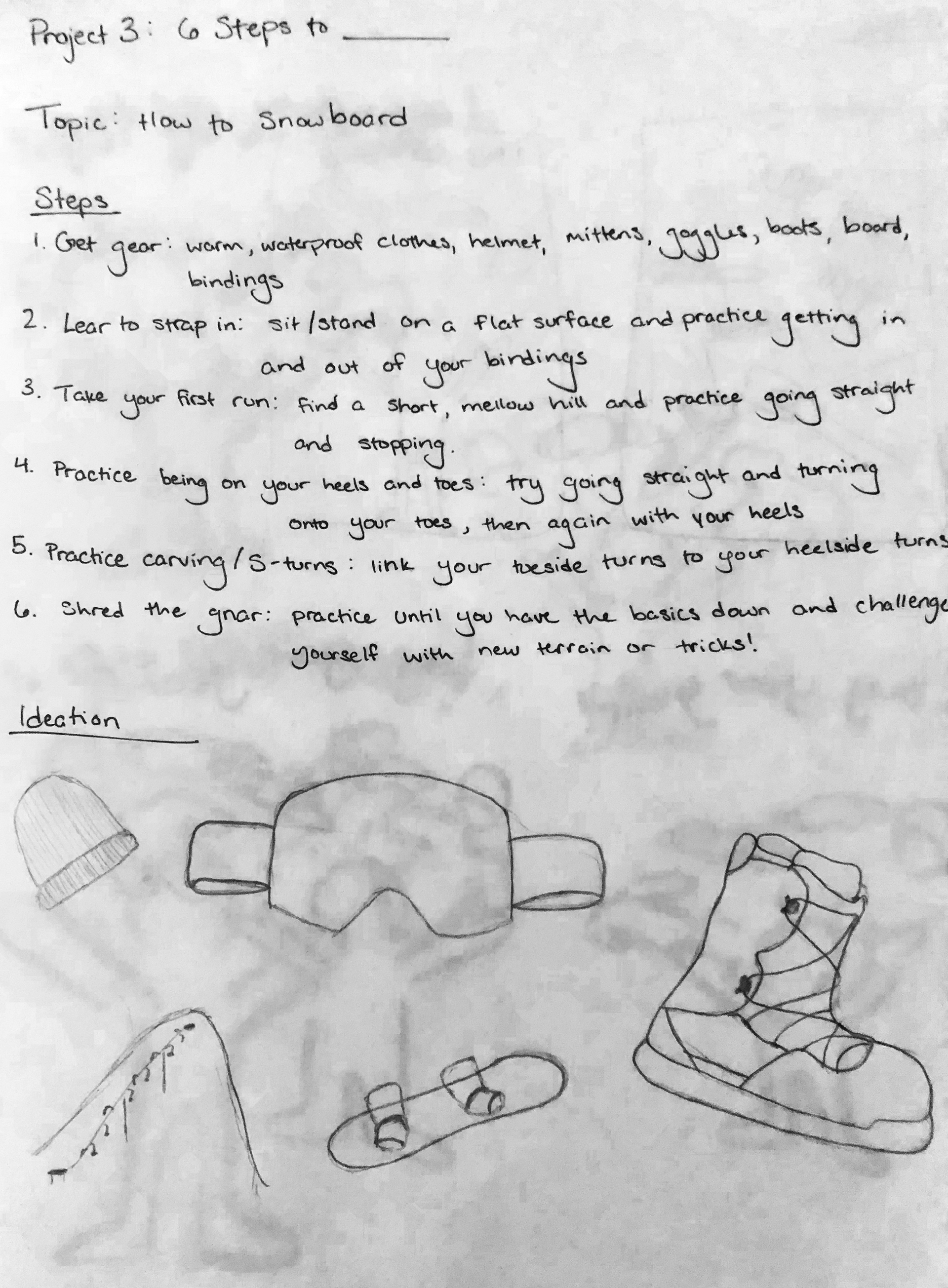
the six-step guide required students to choose a teachable topic and create a "how-to" guide of six steps. My guide is titled "teach yourself to snowboard in six steps." The guide gives the audience six steps to attempt learning to snowboard on their own with the use of icons and assisting text.
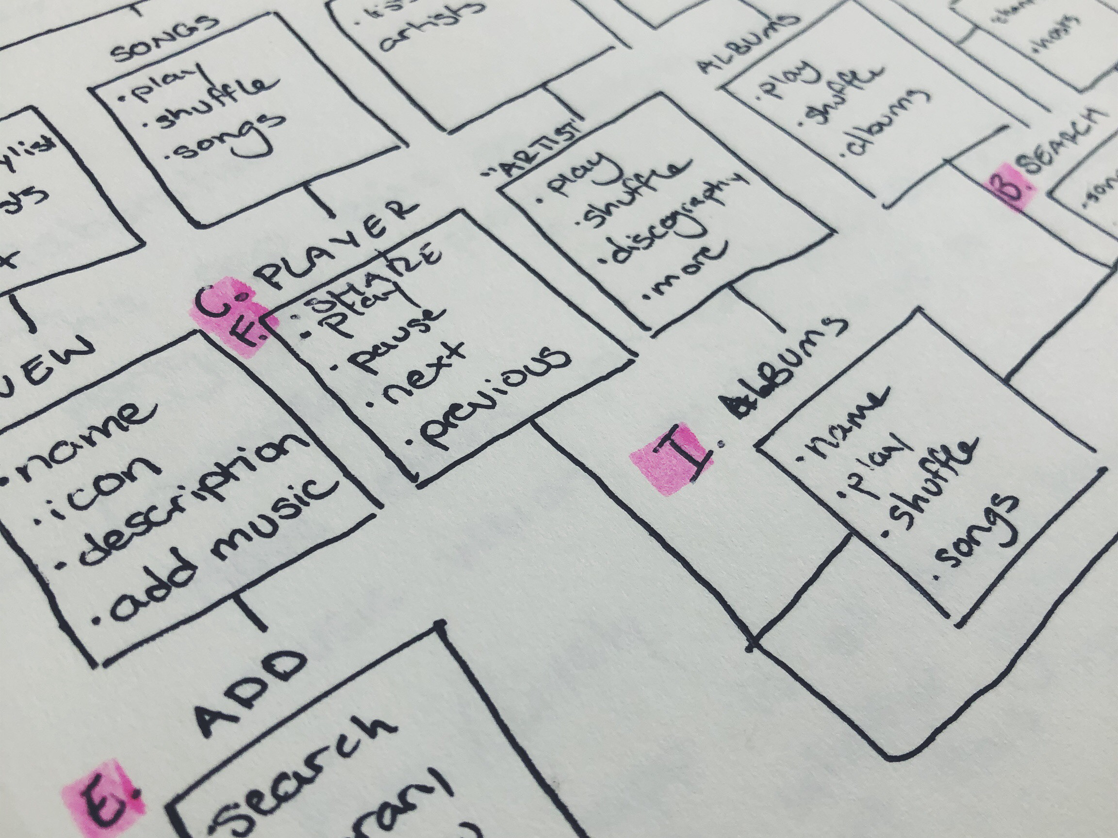
INITIAL SKETCHES
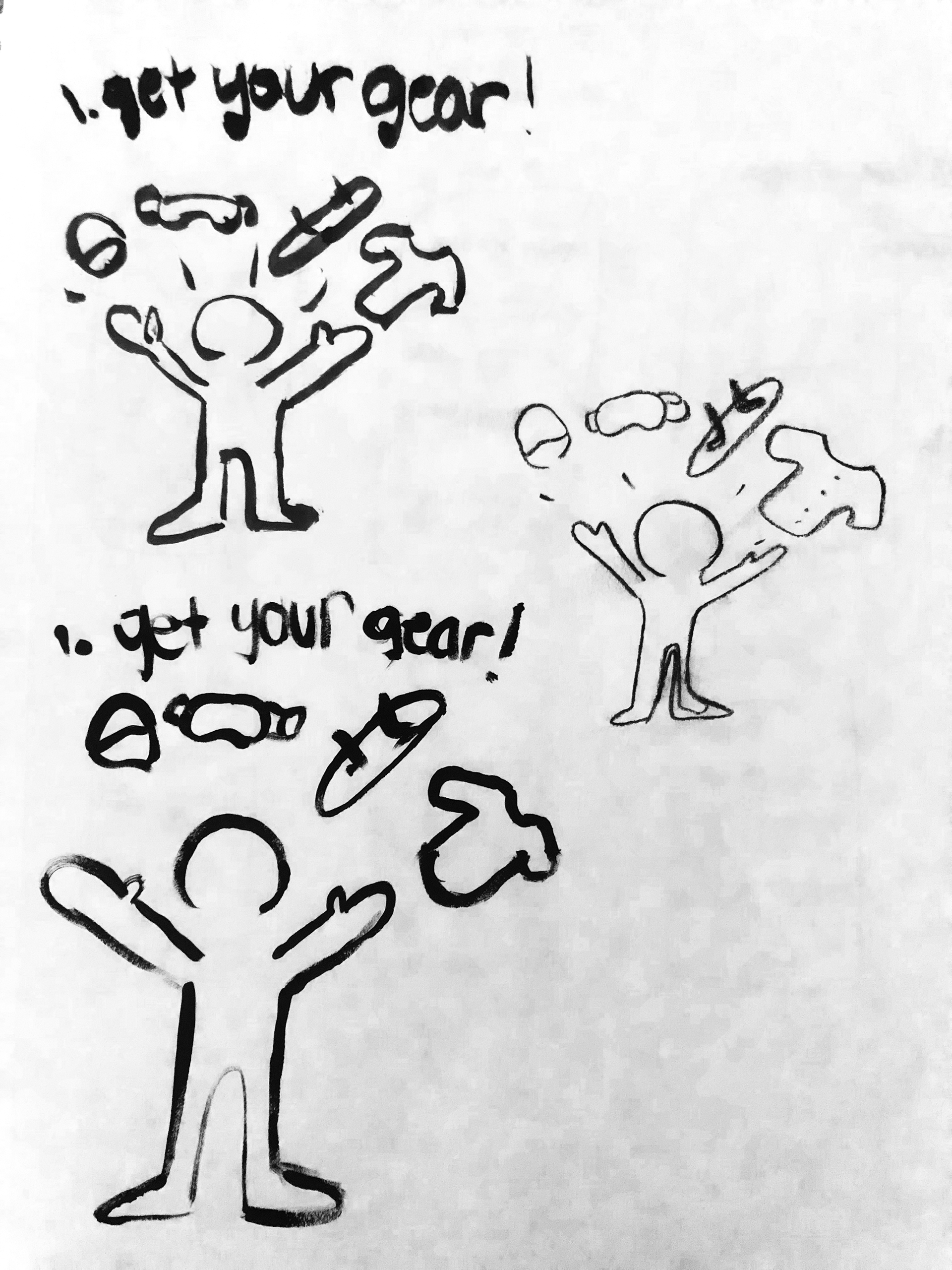
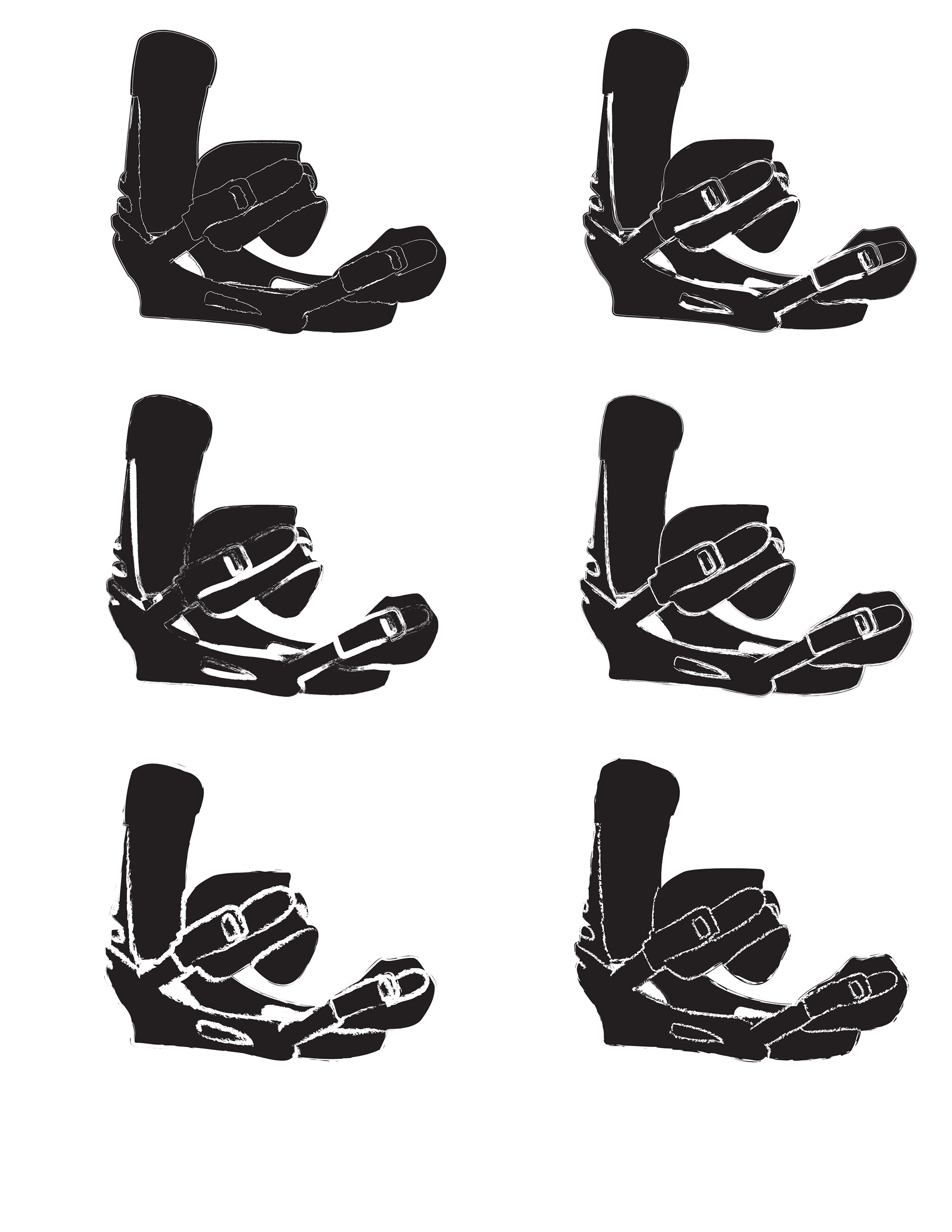
before choosing any specific frames, I tested out a number of materials and styles. for traditional media, I worked with pen, paint, ink, and a variety of charcoals. I chose to pursue digital, but made sure to attempt a style that I was unfamiliar with. working with my binding icon, I tested out a number of brushes and textures. even though I didn't go with charcoal in my traditional studies, I wanted to incorporate its characteristics in my digital design and went with a thick charcoal brush. I additionally chose to offset the line art from the fill color for my final style.
FINAL PRODUCT
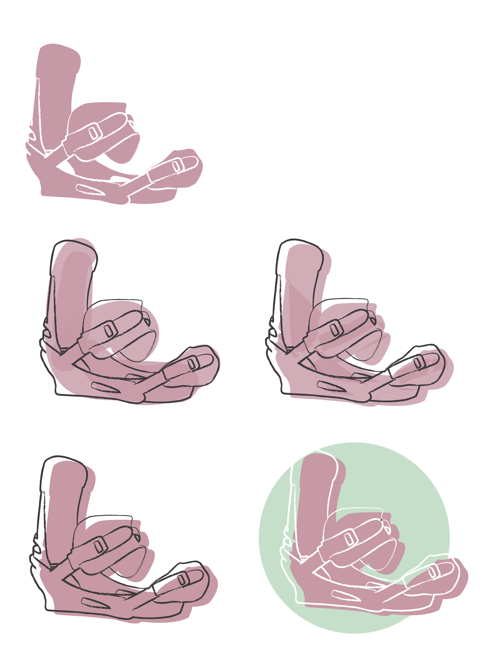
my final product saw a lot of small changes from my first draft. I had my chosen colors, but had to experiment with different ones or different transparencies to test out the best schemes and effects for readability and hierarchy. I ultimately stuck with my original six-color palette. I incorporated the circle system across the board as well, whereas in some frames they originally were full drawings without the circles. I added labels to my sixth step to introduce what exactly the features were instead of assuming the audience was familiar with park features. my biggest change was rewording my third and fourth steps completely so that it read the way I wanted it to.