project brief
The #AppreciatingSimplicity campaign project focuses on spreading a positive message by highlighting a small aspect of life. This campaign is meant to bring something positive amidst the COVID-19 pandemic and continue on as a timeless message.
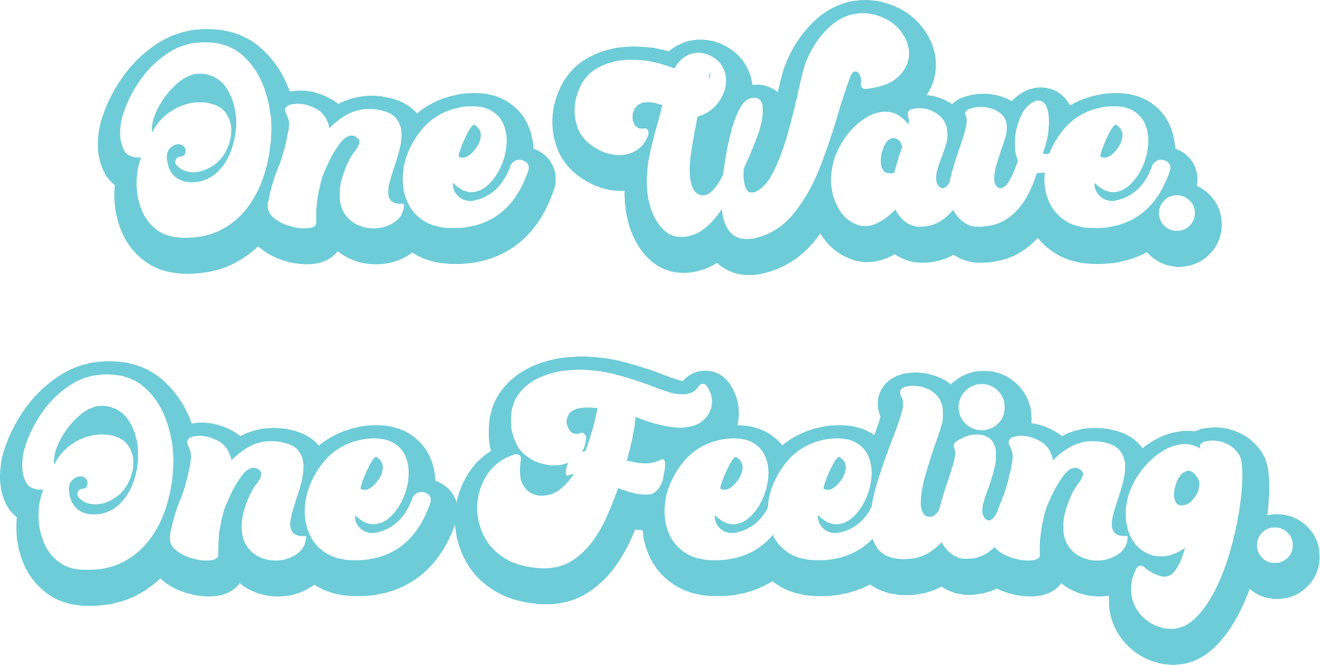
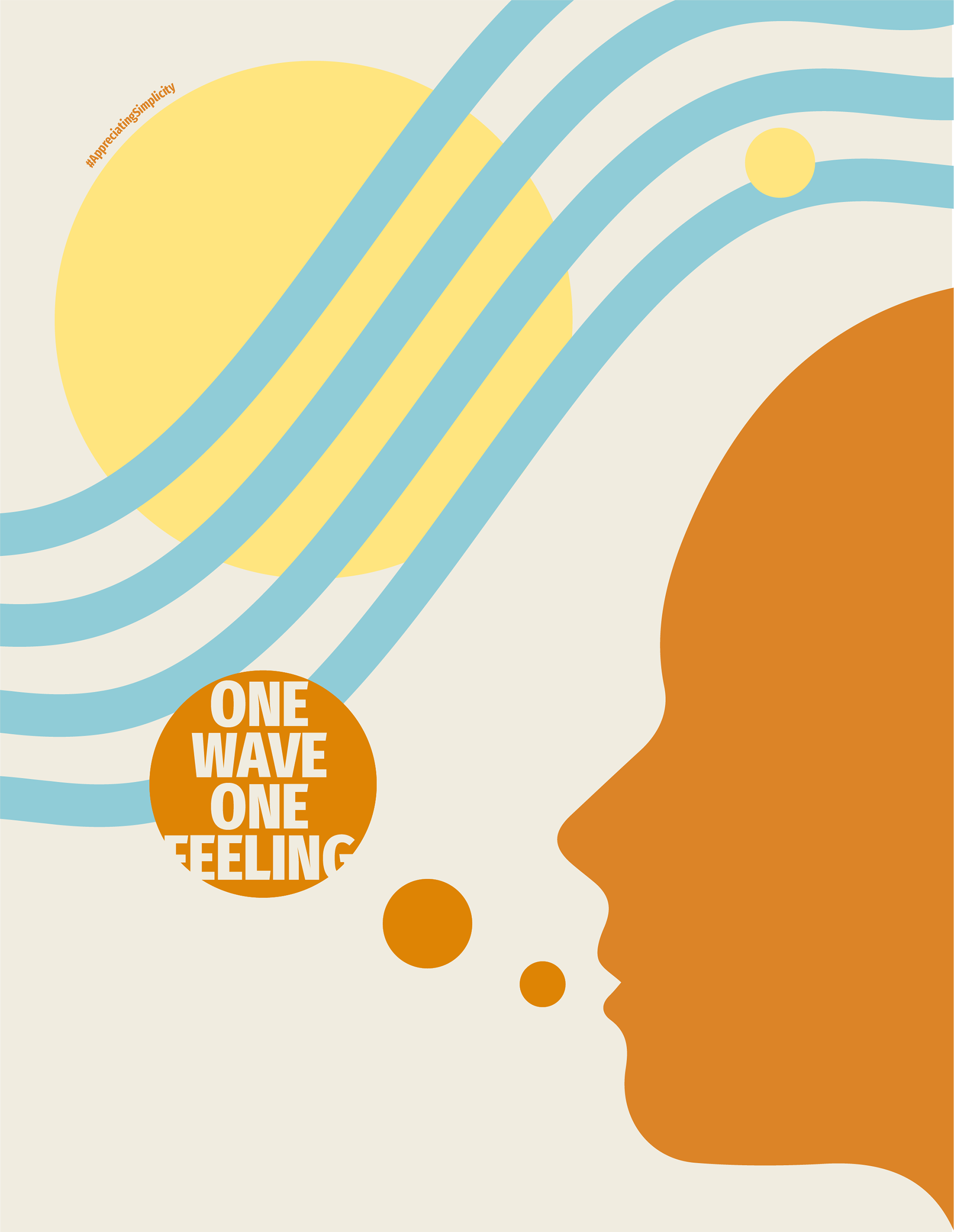
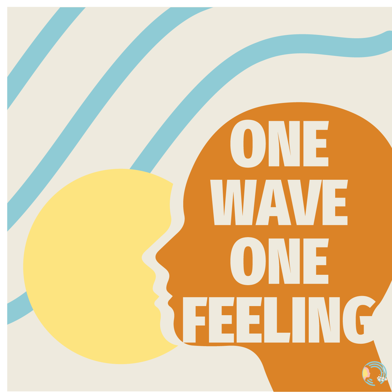
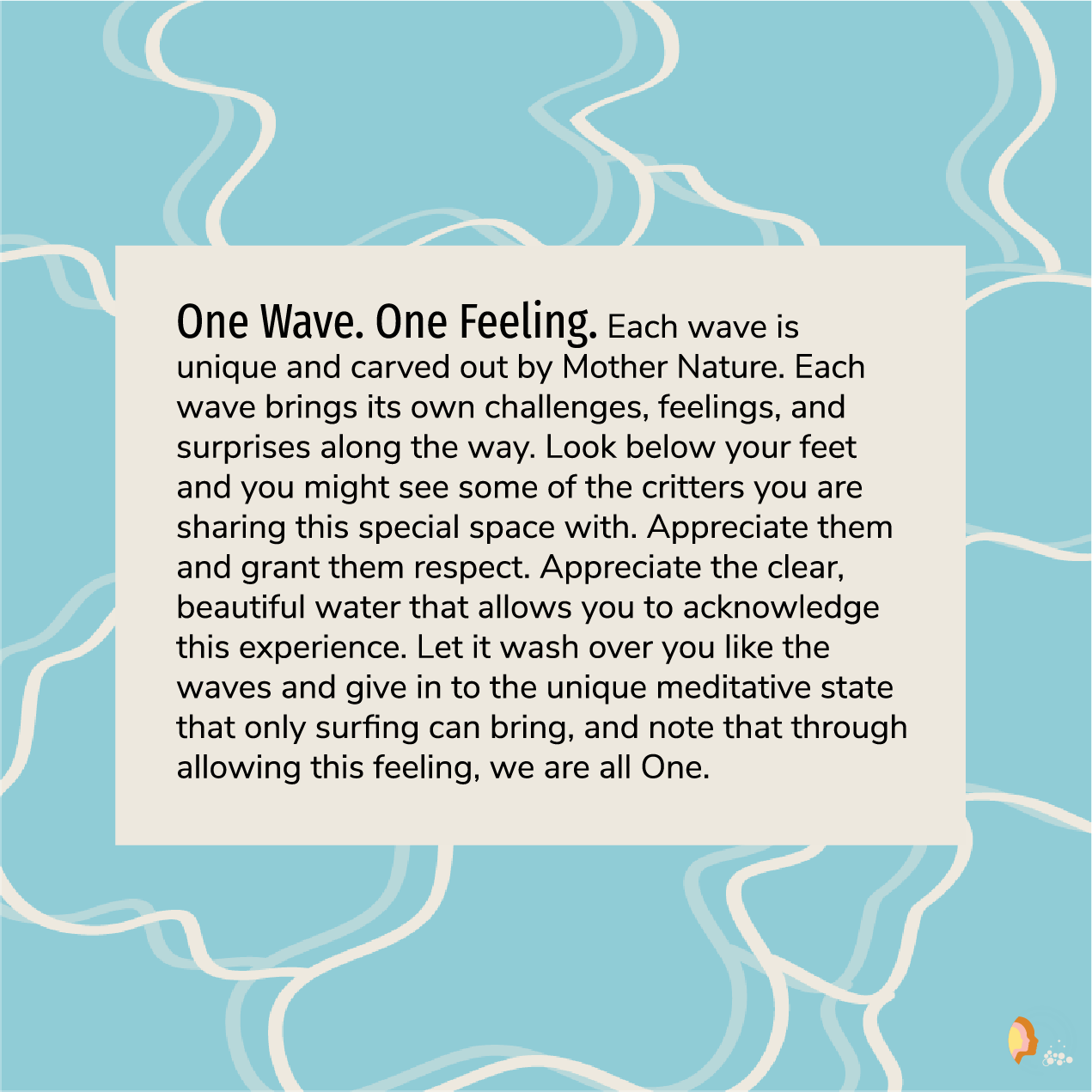
#OneWaveOneFeeling is centered around the spiritual nature of surfing. Each wave brings a unique experience that centers one with the universe and opens the mind and soul. This campaign uses 70's nostalgia to bring up the timeless "groovy" feeling of surfing.
research & mood board
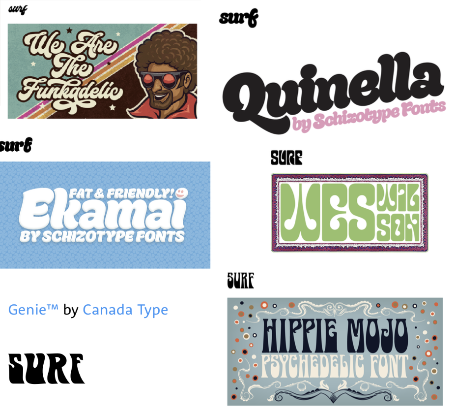
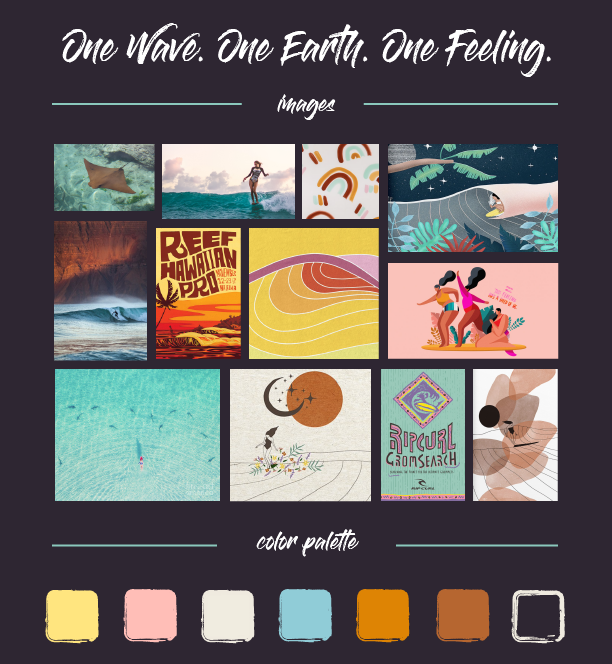
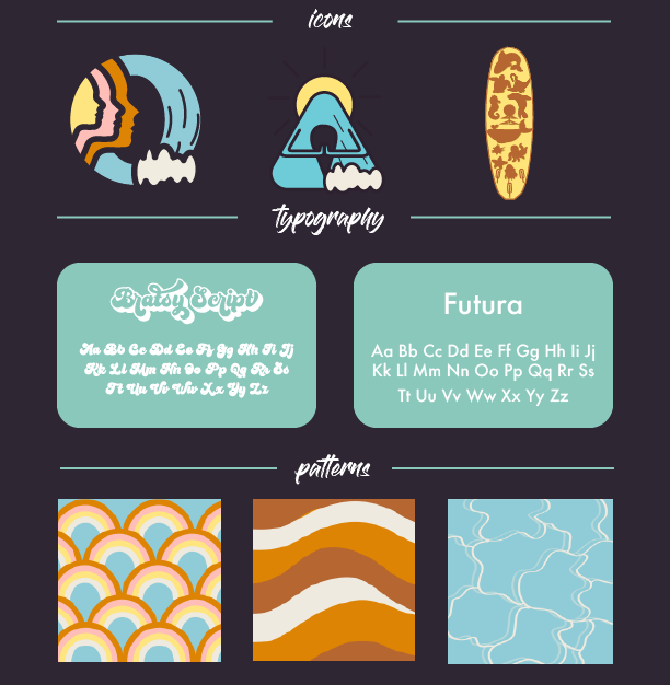
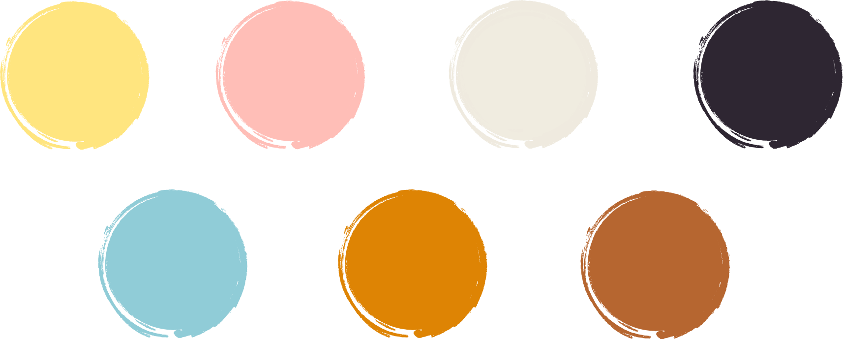
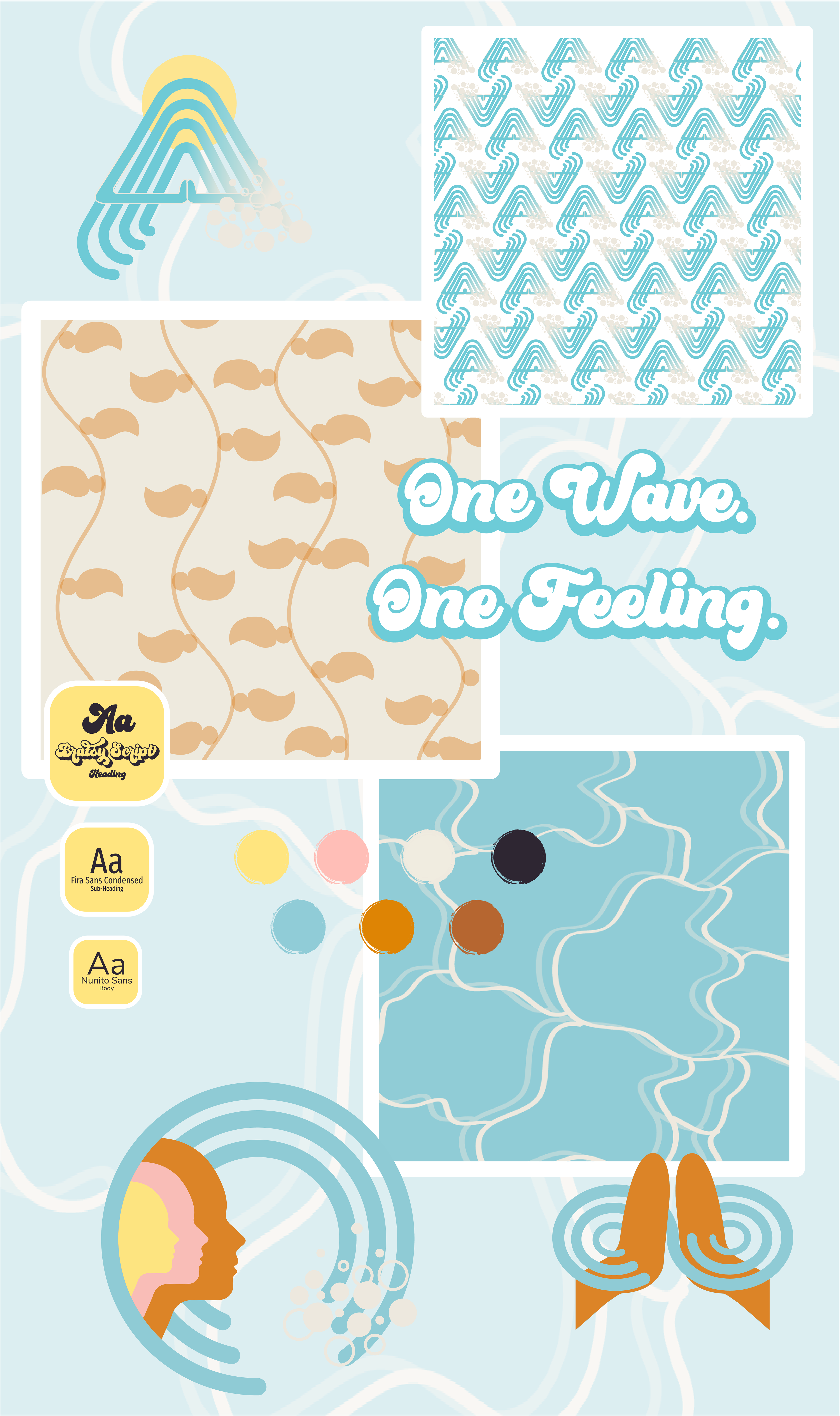
I started off with some word-association to guide the message of the campaign. From there I researched the 70's aesthetic, the mystical feeling of surfing, and aspects of nature and togetherness for my mood board. I gathered some psychedelic-inspired fonts and sampled softs colors from my photos. From there I made some preliminary icons and patterns to finalize the aesthetic of my campaign.
6 NOUNS: consciousness| gratitude | fascination | elation | harmony | connection
6 VERBS: balance | admire | glide | respect | share | meditate
6 ADJECTIVES: calming | cleansing | humbling | religious | soulful | introspective
design systems
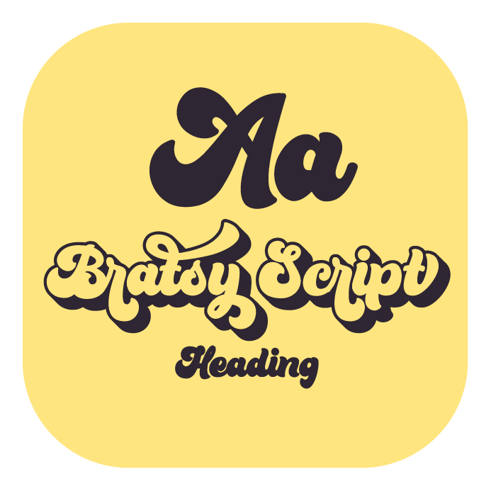


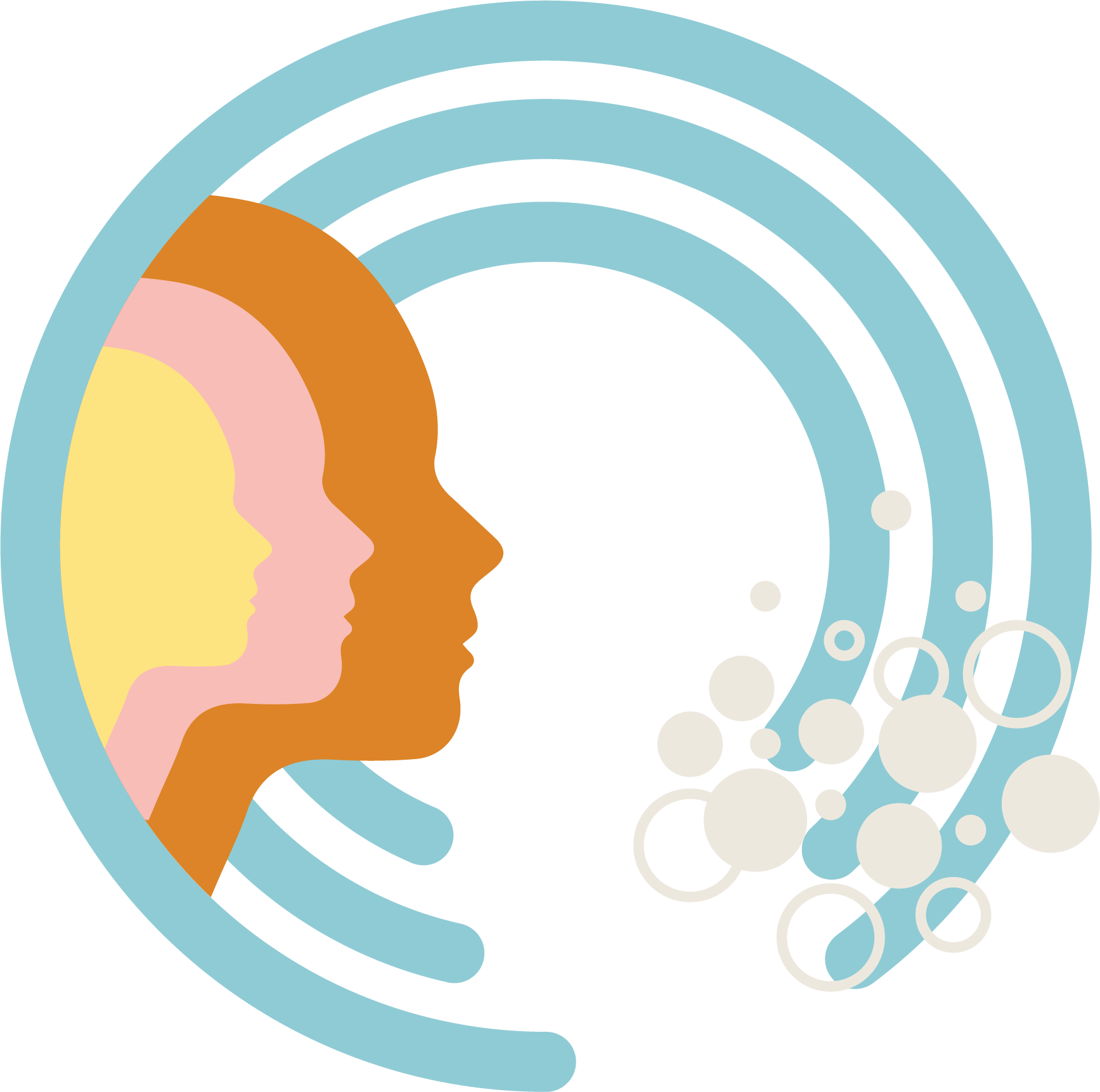
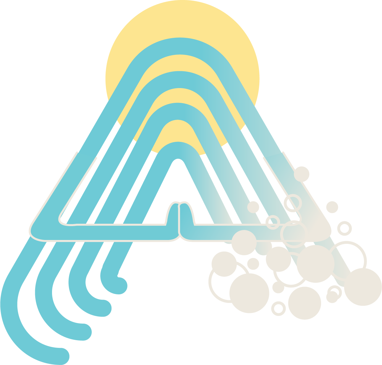
logo type & icons
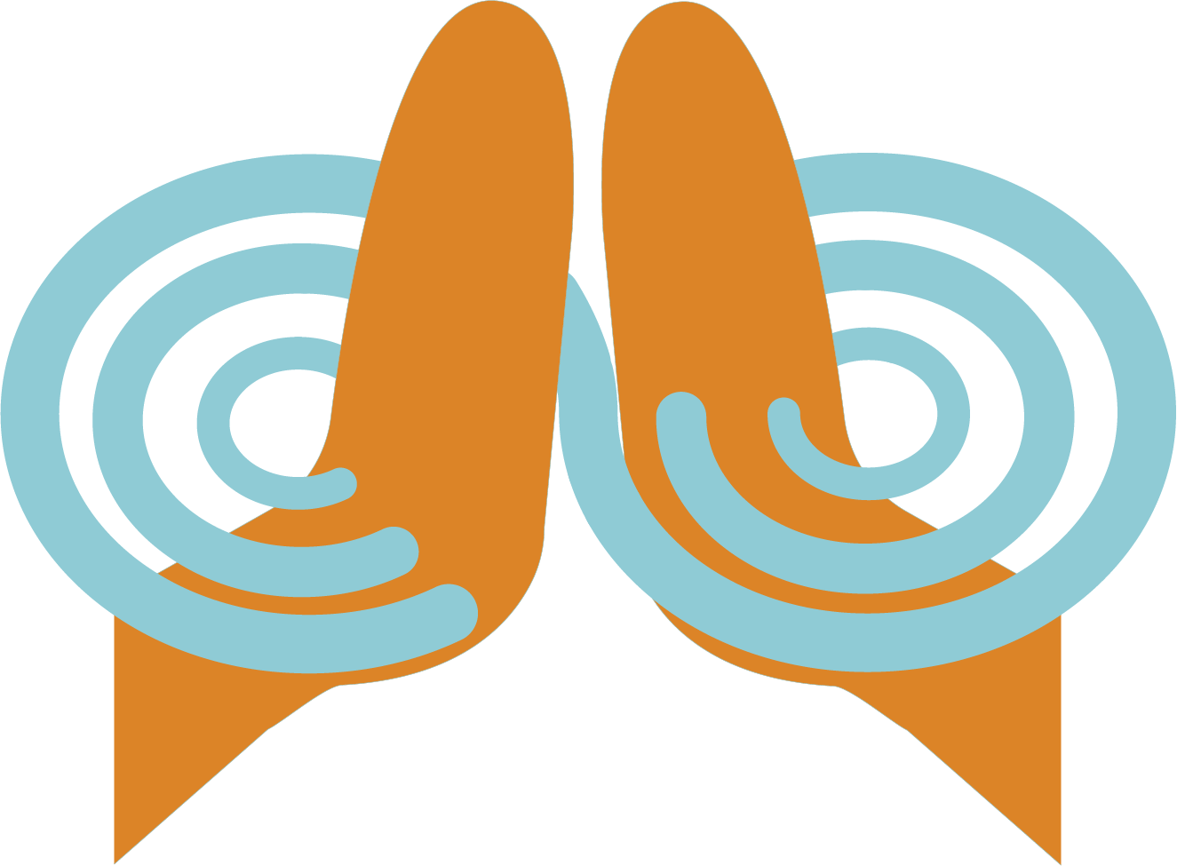
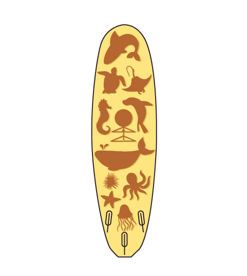
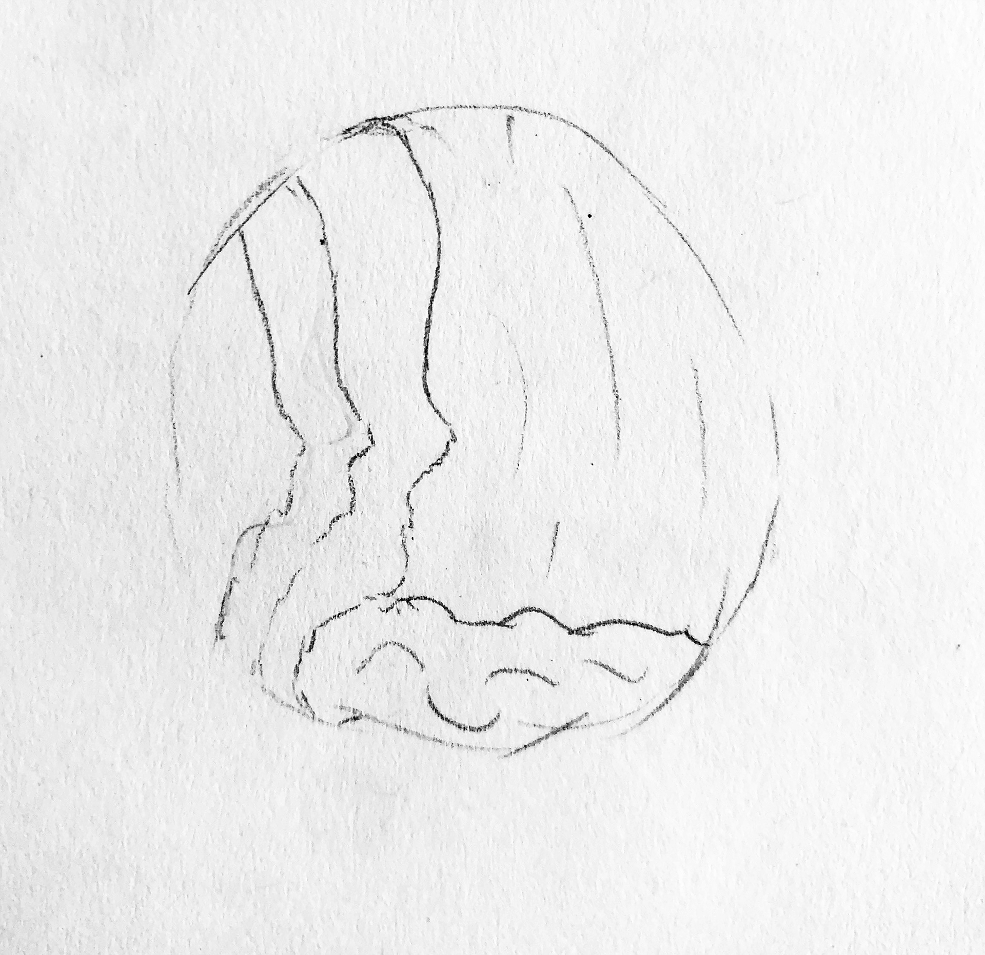
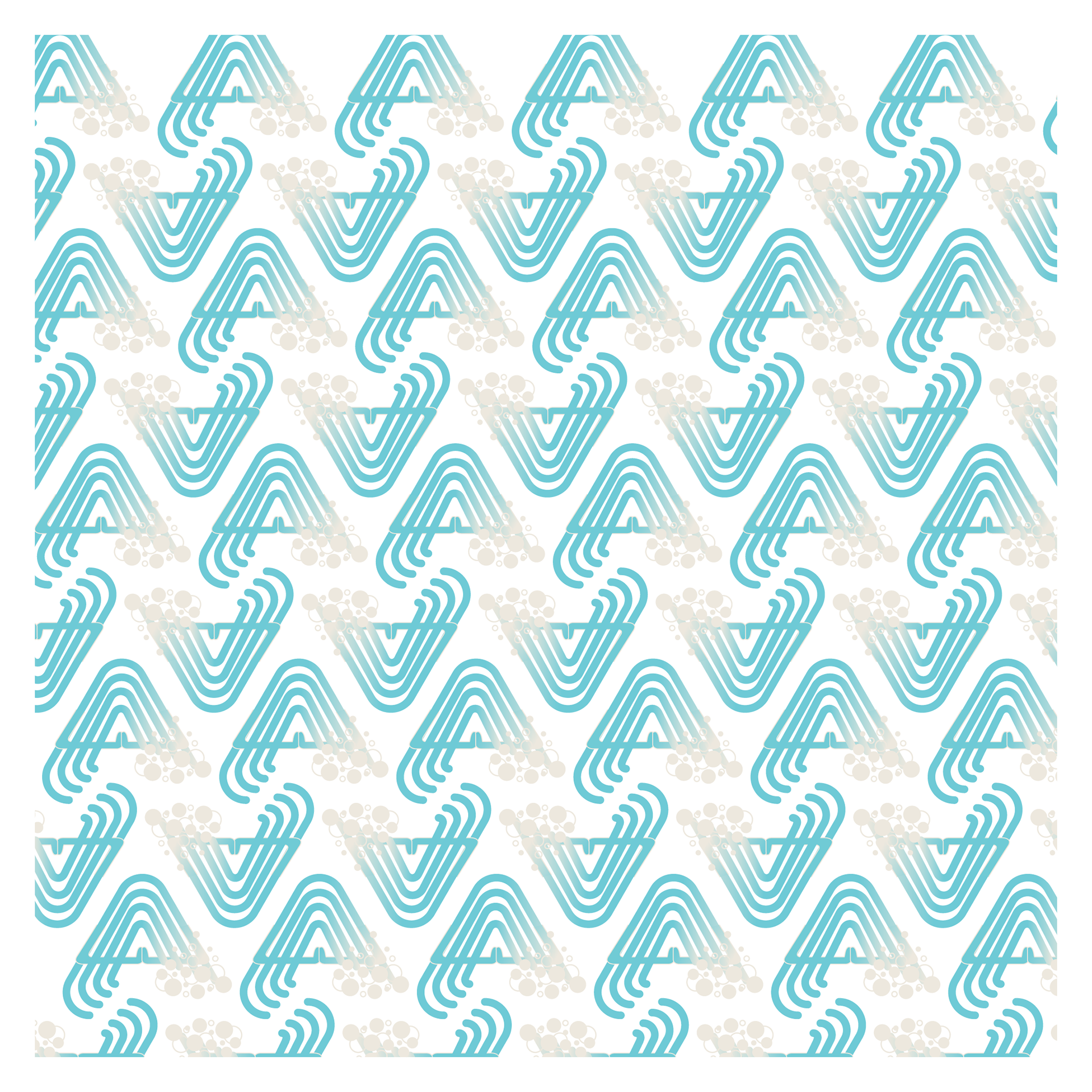
The icons I developed for the campaign went through some drastic changes. I was locked in on a meditating wave, and had to figure out two other ways to depict this state of "one-ness". My first set included some silhouettes within a wave and a surfboard with the different life forms of the ocean surrounding a meditating person. The originals then transformed into a more modern, abstracted form. I scrapped the surfboard all together and went for a bolder icon of meditating hands being infinitely tied to the water.
final
preliminary version


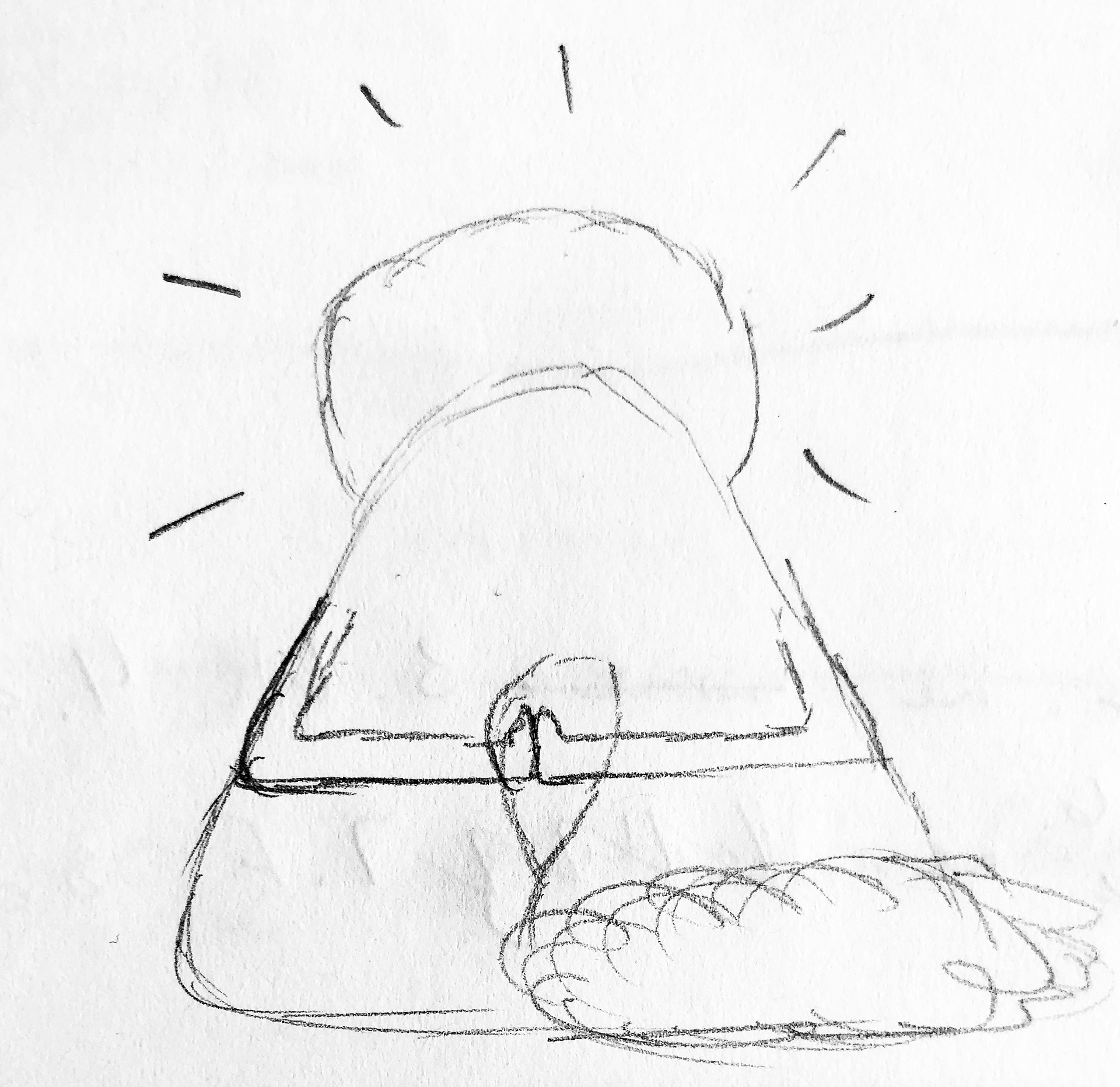
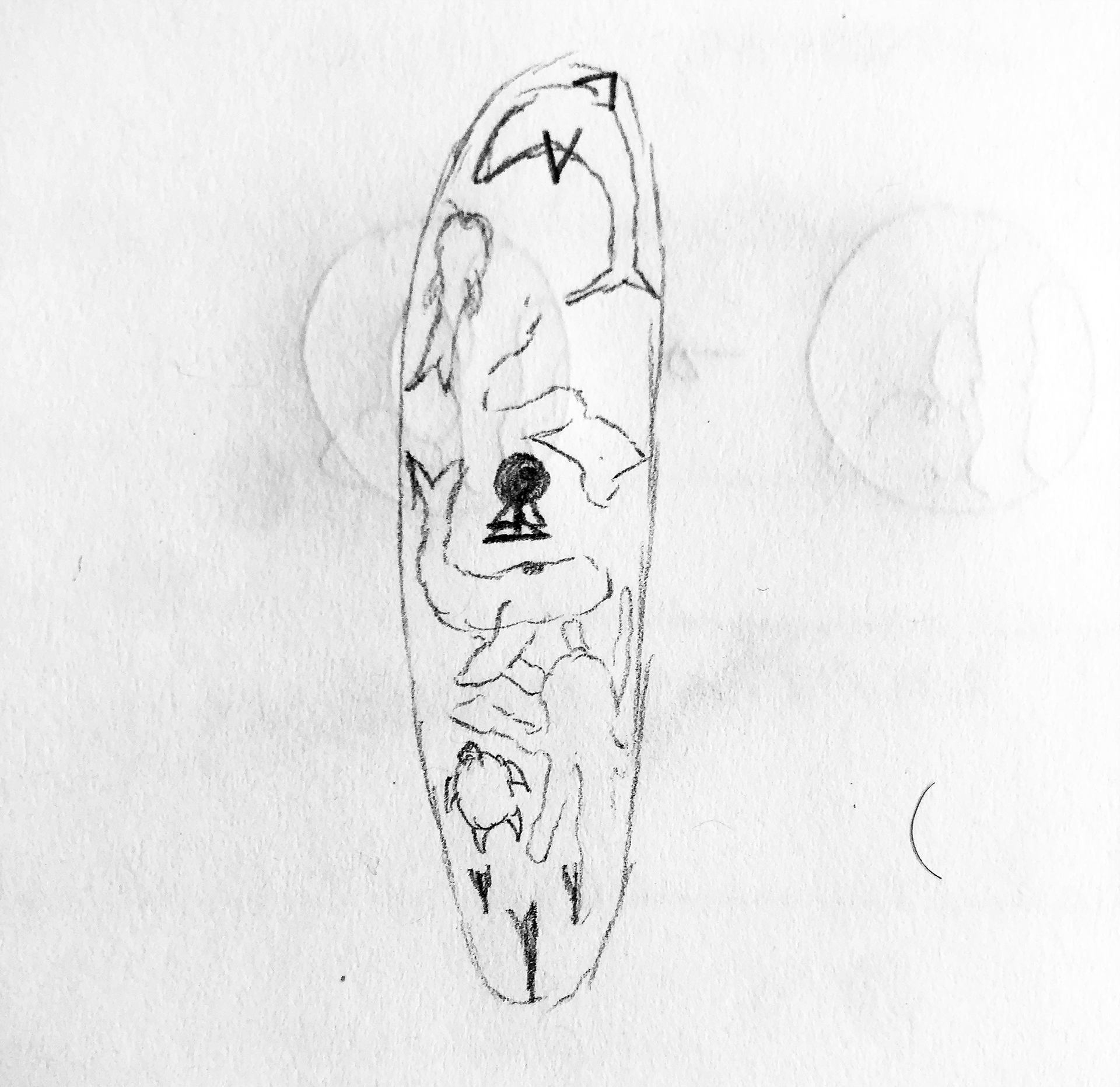
sketches
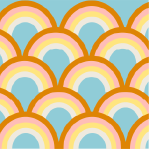
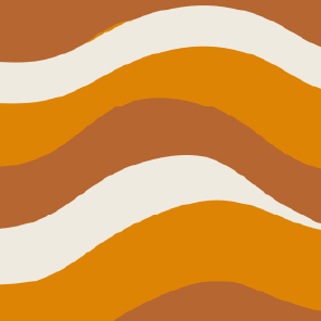
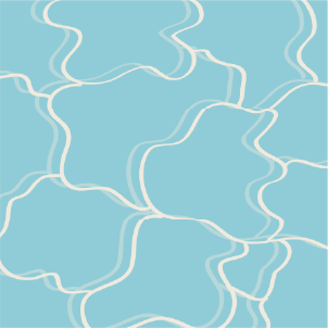
patterns
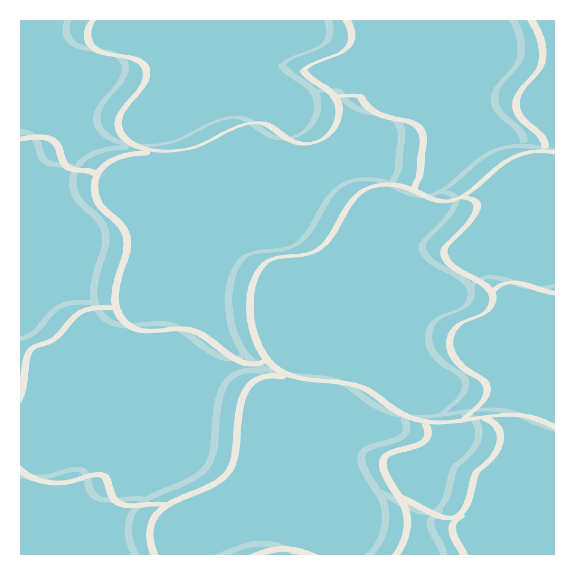
I originally created patterns that resembled more closely to my research. These evolved greatly over time, while I kept only one of the original ideas. The inspiration comes from the kelp forests, the ripples in the water, and a pattern from one of the icons.
final
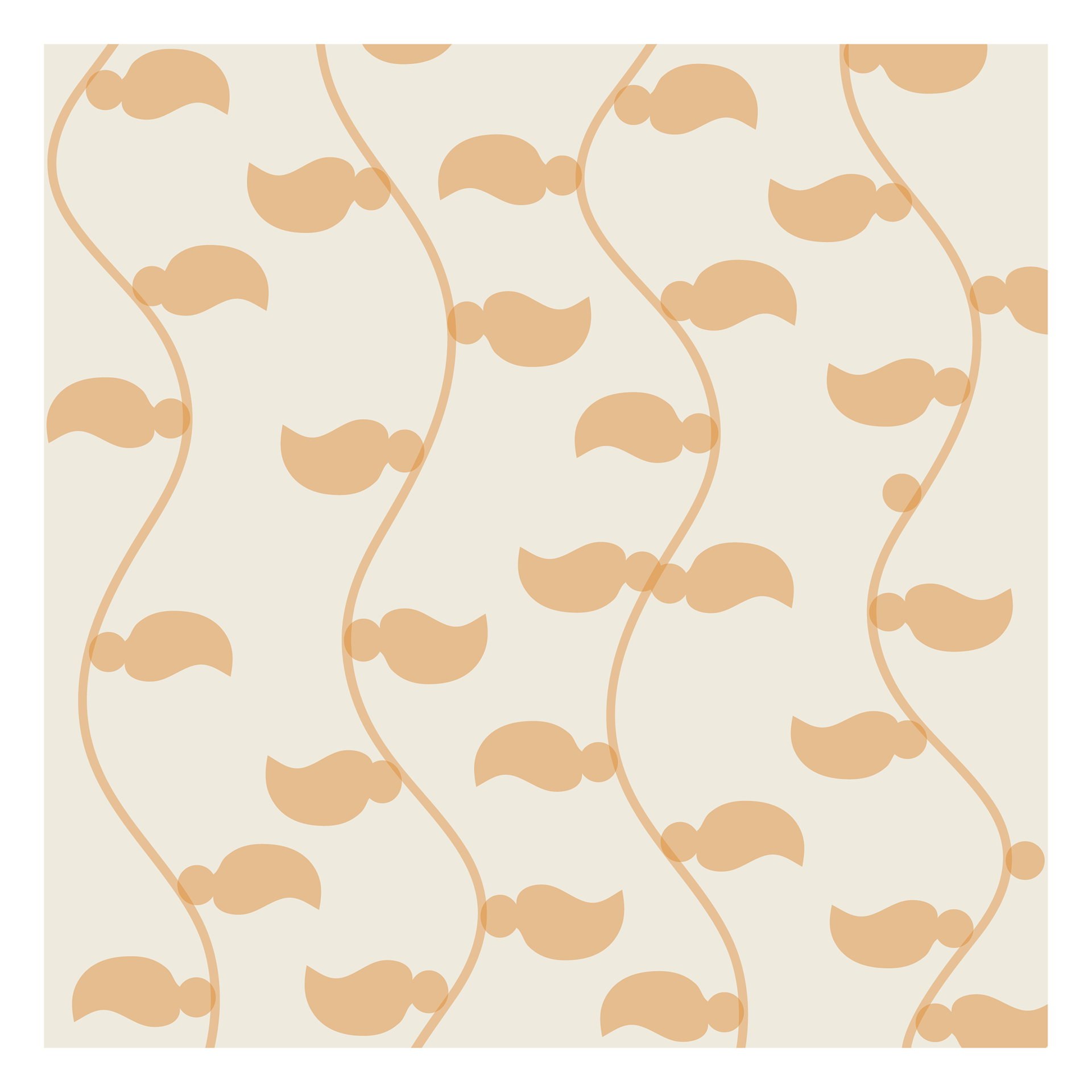
preliminary version
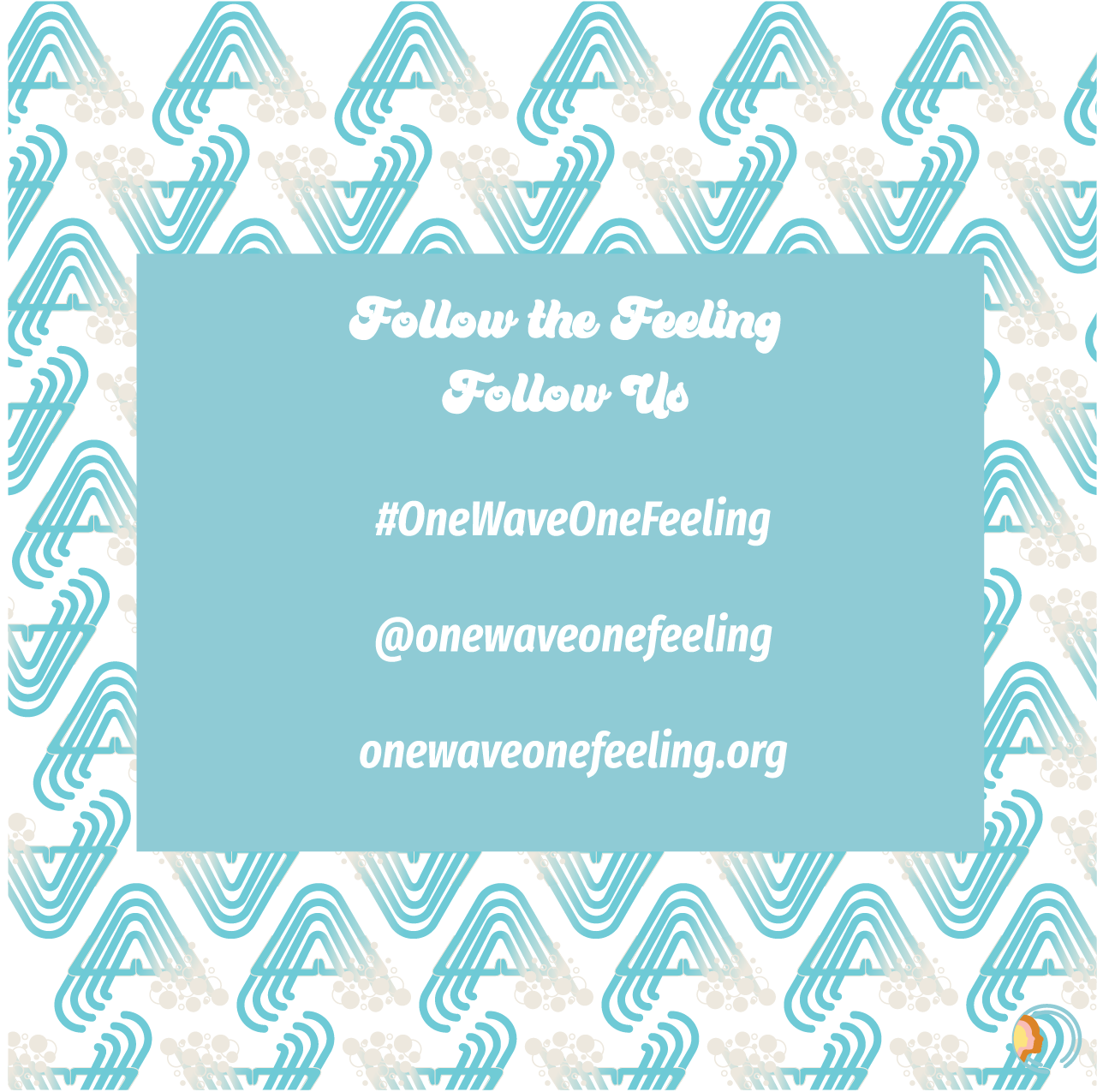
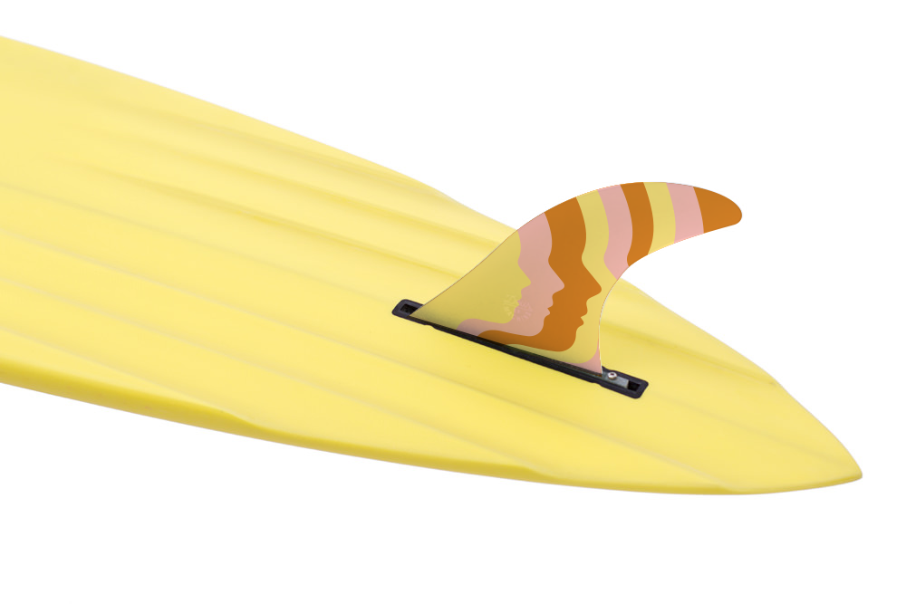
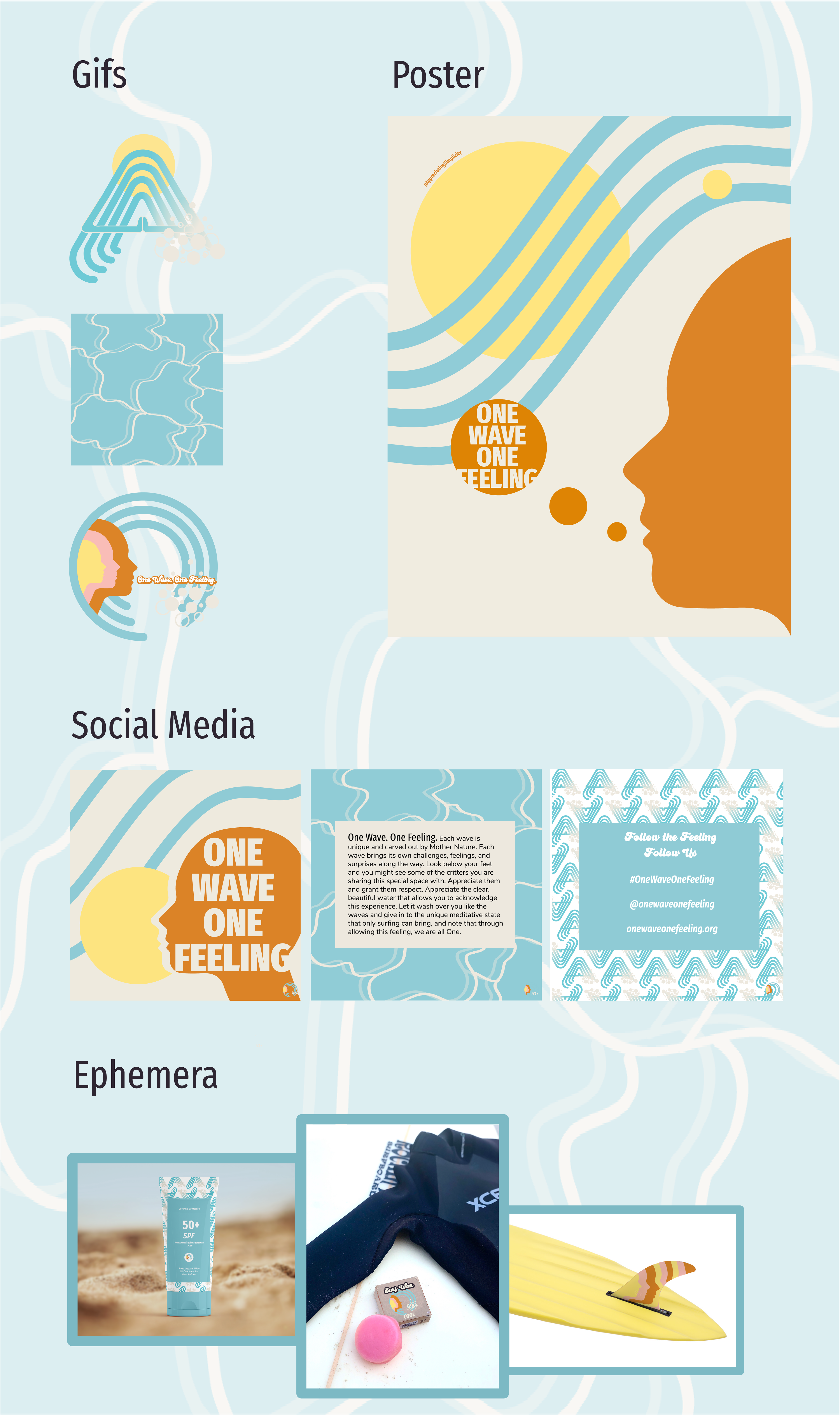
in use: gifs, poster, instagram, ephemera, and website to house design toolkit
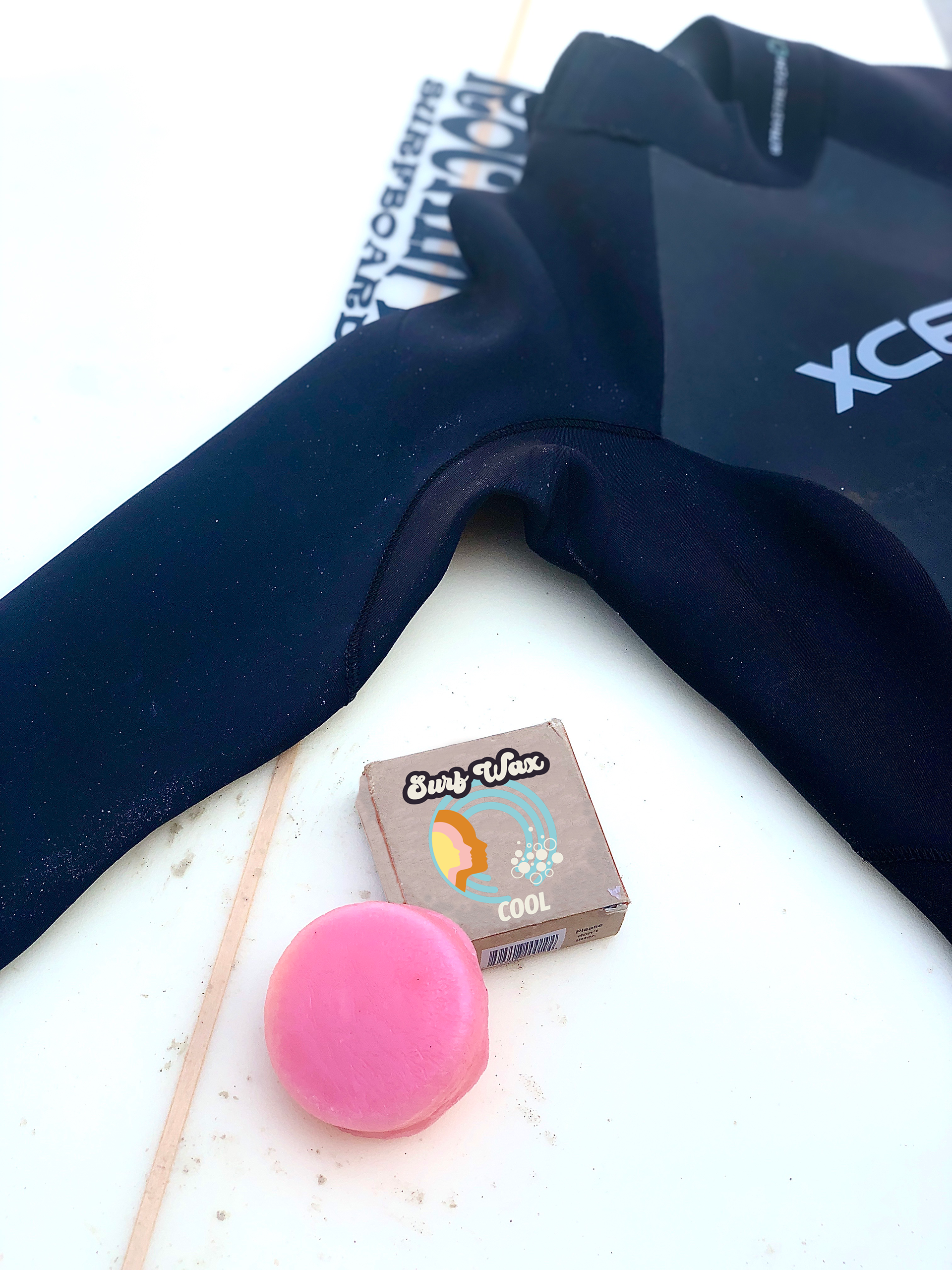
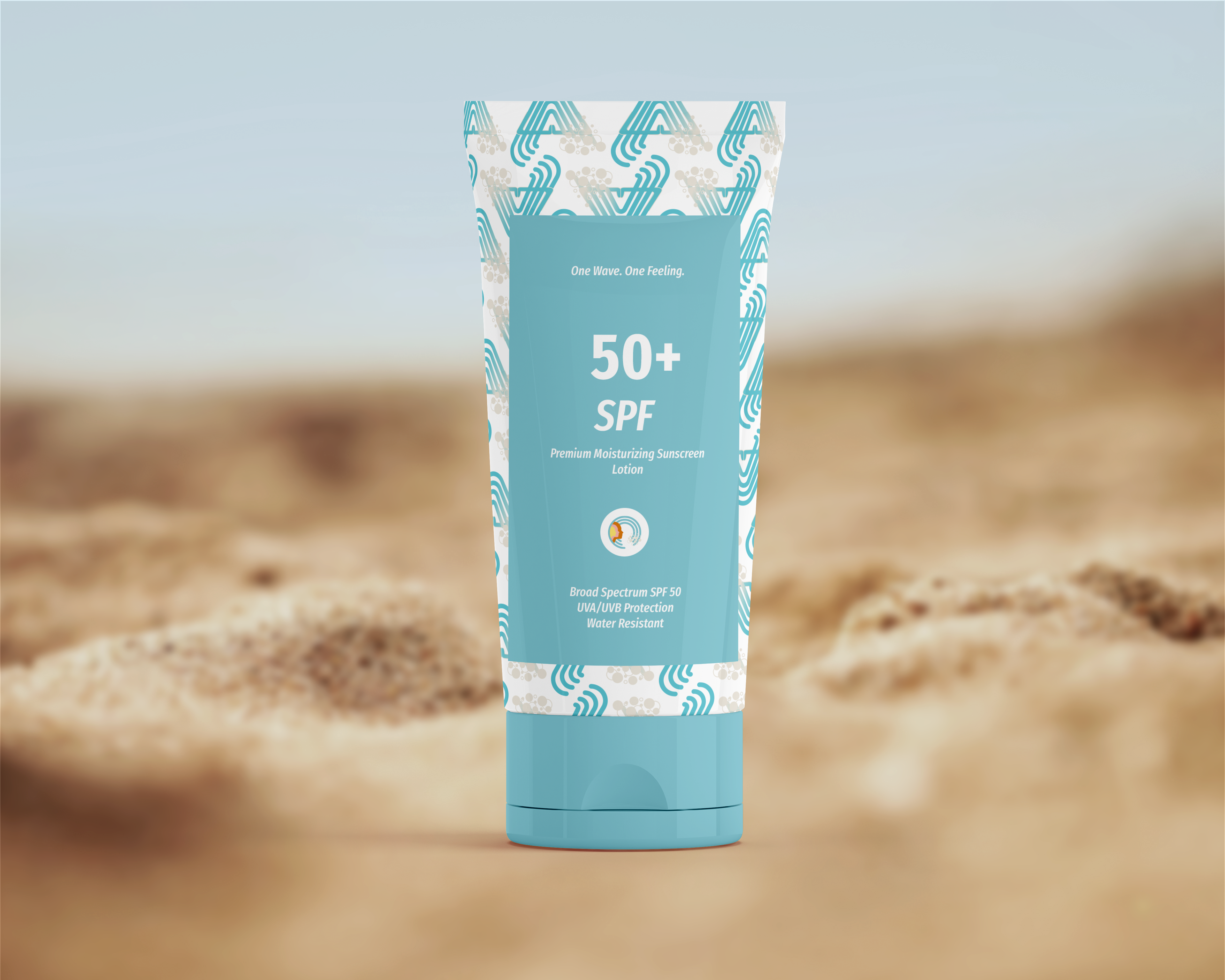
The designs were applied in the following ways to spread awareness of the campaign through physical and digital means. The poster went through a drastic change from a straight-forward icon and text to something more abstract and more interesting. This design was also applied to the instagram carousel. For the ephemera, I chose objects that were unique to my campaign: sunscreen, surf wax, and a surf fin. The mock-ups are a mix of a template, my own photo, and a photo from online that I used.
animated gifs
final poster vs. preliminary

instagram carousel
ephemera
website to house design toolkit
final
sketches